Ironing Out the UX: A Case Study in Laundry Logic
Laundry. It’s the great unifier — everyone has dirty clothes, but not everyone has the time (or patience) to deal with them. That’s where our client stepped in with an idea:
Let’s build a Laundry Management App where users can assign their laundry jobs to vendors, choose specific services like washing/ironing, decide on delivery preferences, and… oh yeah, split carts for Normal and Express services!”
Wait. Split carts? 😬 We’ll get to that.
Laundry Flow Design
On-Demand Consumer Services (B2C)
Figma
Industry
B2C
Duration
1 Months
Platform
Mobile App
My Role
Lead Designer
Ideation – The Spin Cycle Begins
Like all good ideas, this one began with a universal truth: people hate doing laundry — but love when it's done for them. The business I collaborated with knew this pain point well. They wanted to build more than just a pickup-and-drop service. They were aiming for a smart, customizable laundry experience where users could treat their clothes just the way they wanted, without breaking a sweat.
They had a clear goal in mind: flexibility and control for the user. Whether someone wanted their office shirts neatly ironed , their gym wear just washed , or their silk saree delicately dry-cleaned, the app needed to make it all possible—and easy 🧺👕👚👖👔
But there was more to it than just service selection. The users also needed to:
Choose the speed of service — normal for the patient, express for the last-minute warriors.
Decide how they wanted their clothes returned — folded neatly into a drawer-ready bundle, or hanging wrinkle-free on a hanger.
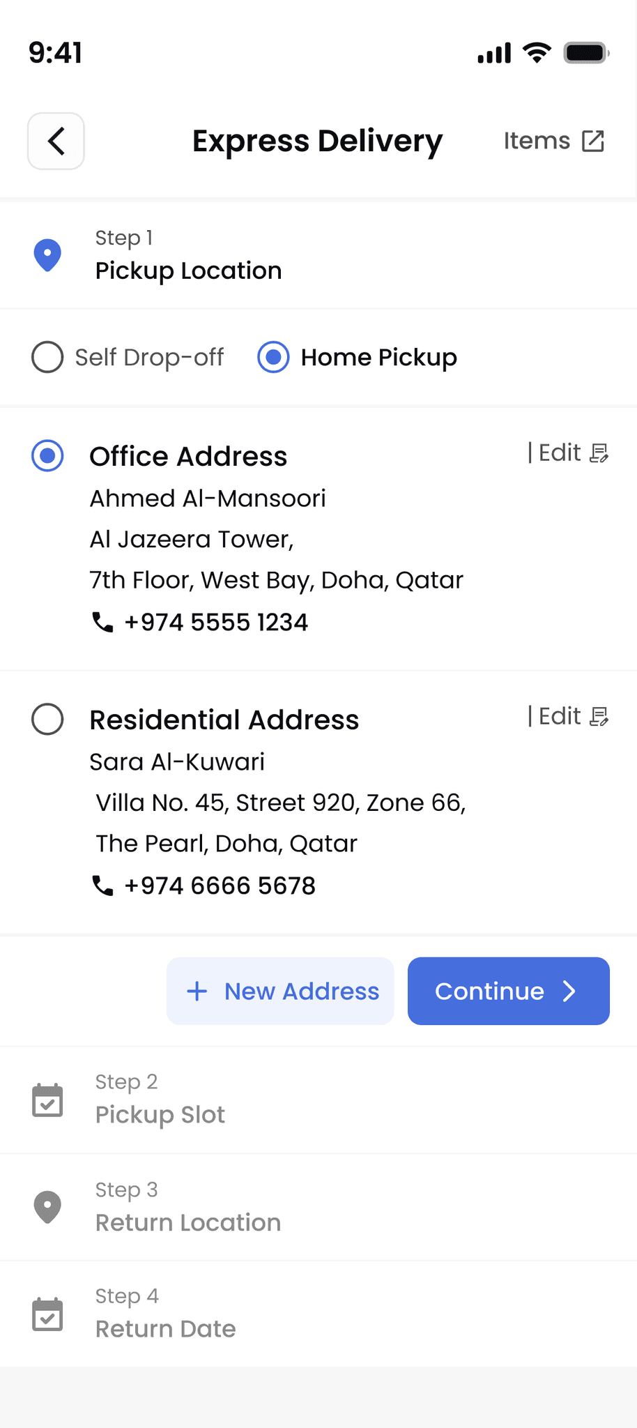
Pick pickup and drop-off options freely — from home pickup to self-drop at the vendor’s location, and any mix-match in between.
Enter their own locations and schedules—no forced slots, no one-size-fits-all model.
And here's the real curveball: pricing needed to vary based on the service speed (normal vs express), and the team wanted to handle those through two entirely separate carts.
That’s right — two separate carts.
At this point, I knew I wasn’t just designing a basic laundry app. I was tackling multi-dimensional user flows, layered configurations, and a client proposal that sounded simple in theory but was threatening to turn the user journey into a washing machine full of friction.
So I asked myself the big design question:
How can we make all of this feel seamless, smart, and (ideally) not like an Excel sheet with detergent?
And that’s where the real work began.
Step 2: Research – Dirty Laundry from the Real World
Before diving into design, I knew I had to do one thing first: Launder my assumptions.
While laundry problems are universal, I was working with a Qatar-based laundry service, and that meant taking local behavior, expectations, and service norms into account. What do users in Qatar expect when they book a laundry service? How tech-savvy are they? And how do they prefer scheduling pickups or customizing services?
To answer these questions, I started with a competitive scan of regional and global players. I explored apps, examining everything from their onboarding flows to how they handled mixed service types. Some were too rigid, some were bloated with options, and many buried key features behind multiple screens.
Then came one of the most honest sources of feedback: App Store and Play Store reviews. I combed through user complaints and praise from laundry service apps used in the Middle East. Here’s what kept showing up:

To better understand how people mentally group laundry tasks, I started by walking in the user’s (sometimes freshly pressed) shoes.
To better understand how people mentally group laundry tasks, I started by walking in the user’s (sometimes freshly pressed) shoes.
Journey 1: “I need these ready by tomorrow
Meet Sara — a 28-year-old marketing executive in Doha. She has a 9 AM client meeting, 3 wrinkled shirts, and less than 24 hours to look put together.
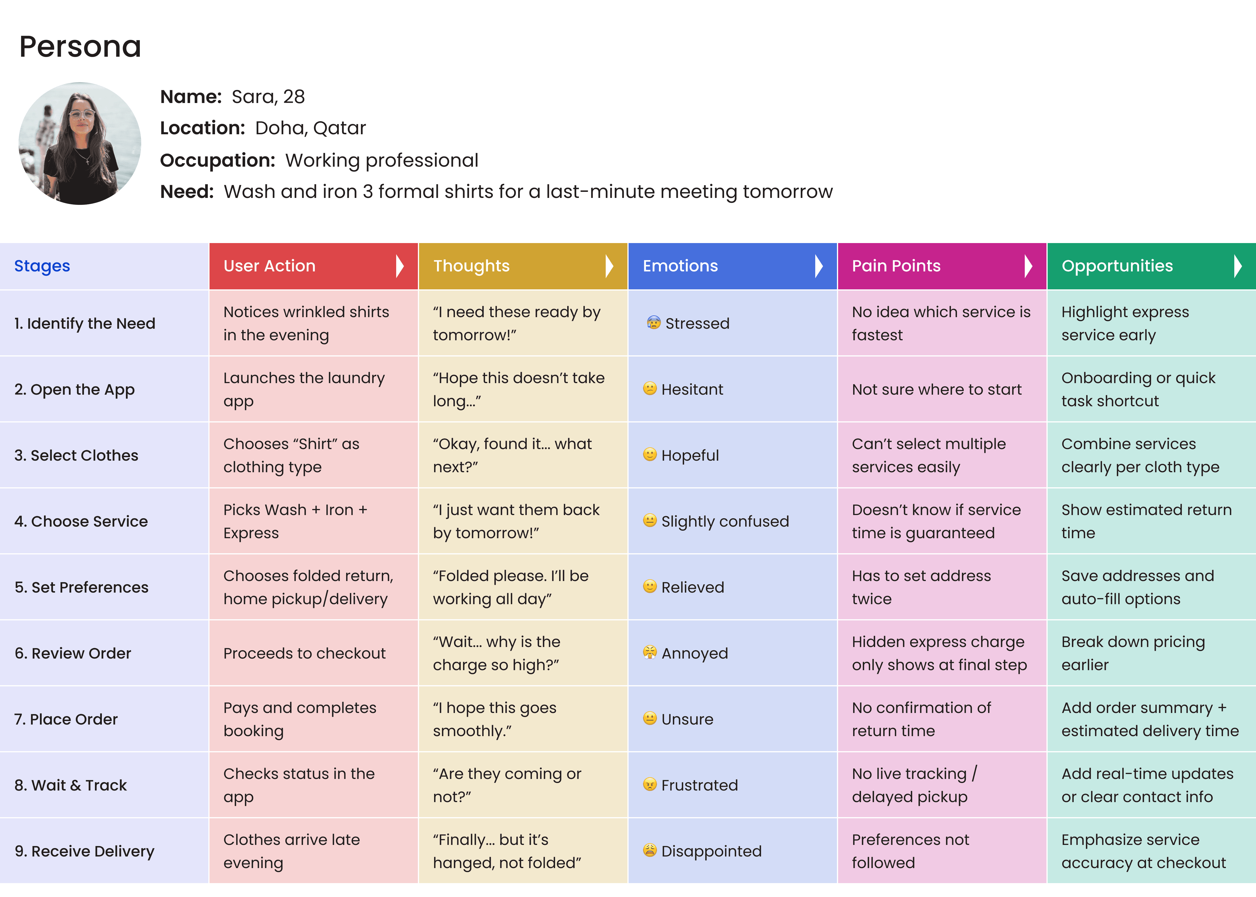
I mapped out every step of her experience, from decision to delivery
Real-World Reflections
This wasn’t just Sara’s problem. I saw these same pain points echoed across:
Competitor apps — Beautiful designs, but service logic that confused users
App reviews — “Too many steps.” “Didn’t get what I selected.” “Charged more than expected.”titor apps — Beautiful designs, but service logic that confused users
User conversations — People weren’t organizing their needs into carts or service categories.
They were thinking: “This shirt = wash + express + folded.”
Key Takeaway
Users don’t think in systems. They think in tasks.
They don’t want to manage two carts. They want to manage their outfits, their deadlines, their lives.
That’s why I replaced the original cart-based logic with a task-first flow — allowing users to build their order based on what each item needs, rather than how the business splits services.
This user journey exercise didn’t just uncover usability gaps — it reframed how I approached the entire structure of the app.
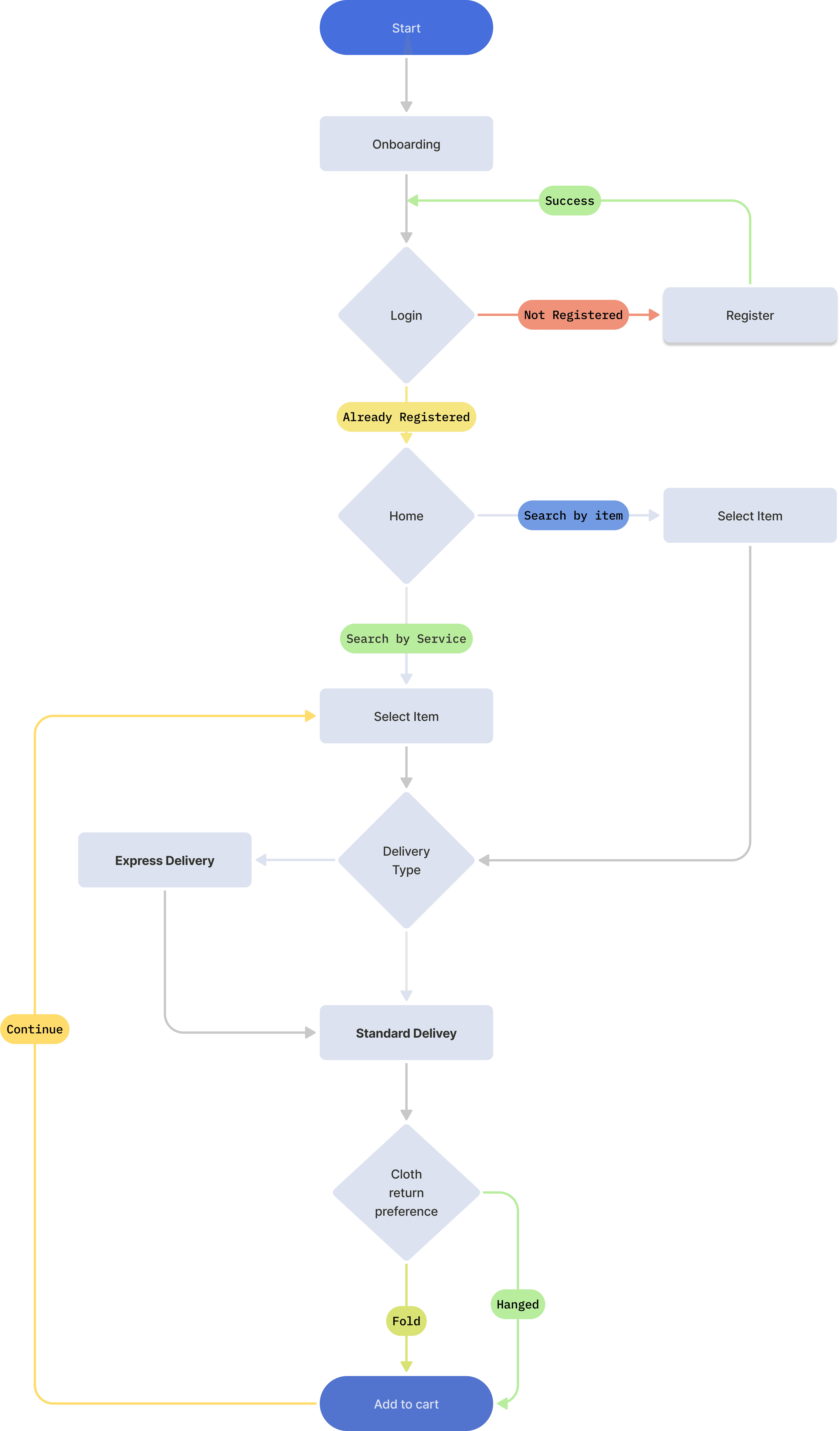
Step 3: Core Flow Breakdown
No one opens a laundry app just for fun. They do it because something’s wrong — and they need help
But once users open the app, it’s all about making sure nothing else gets messy. Not the experience. Not the logic. Not the flow. So I stitched together a user journey that felt natural, intuitive, and (dare I say) fresh-smelling.
Let’s walk through the core flow — not as a dry list of features, but as a day in the life of our user:
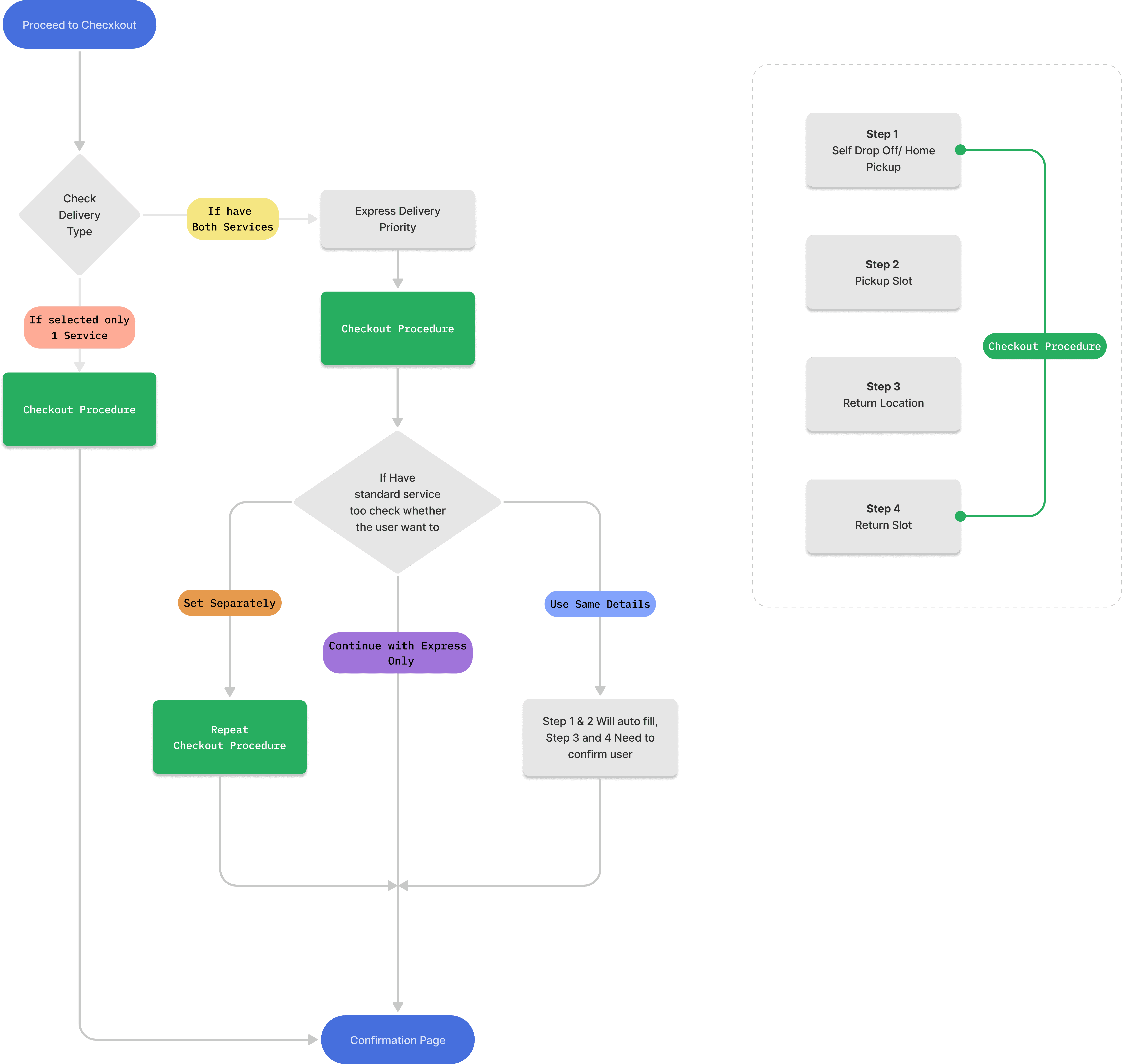
User Flow : Checkout
Step 4: The Cart Chaos – And My Alternative Solution
When the client first shared their vision, things got… well, a little tangled.
Client’s Request: Two Carts, Two Journeys
The proposal was to split the user’s order into two completely separate carts:
One for Normal Service
One for Express Service
Each cart would have its own flow, own checkout, and essentially act like two standalone orders. While this approach made sense from a backend or operations perspective — for the user, it felt like being asked to do laundry twice.
And nobody signs up for that.
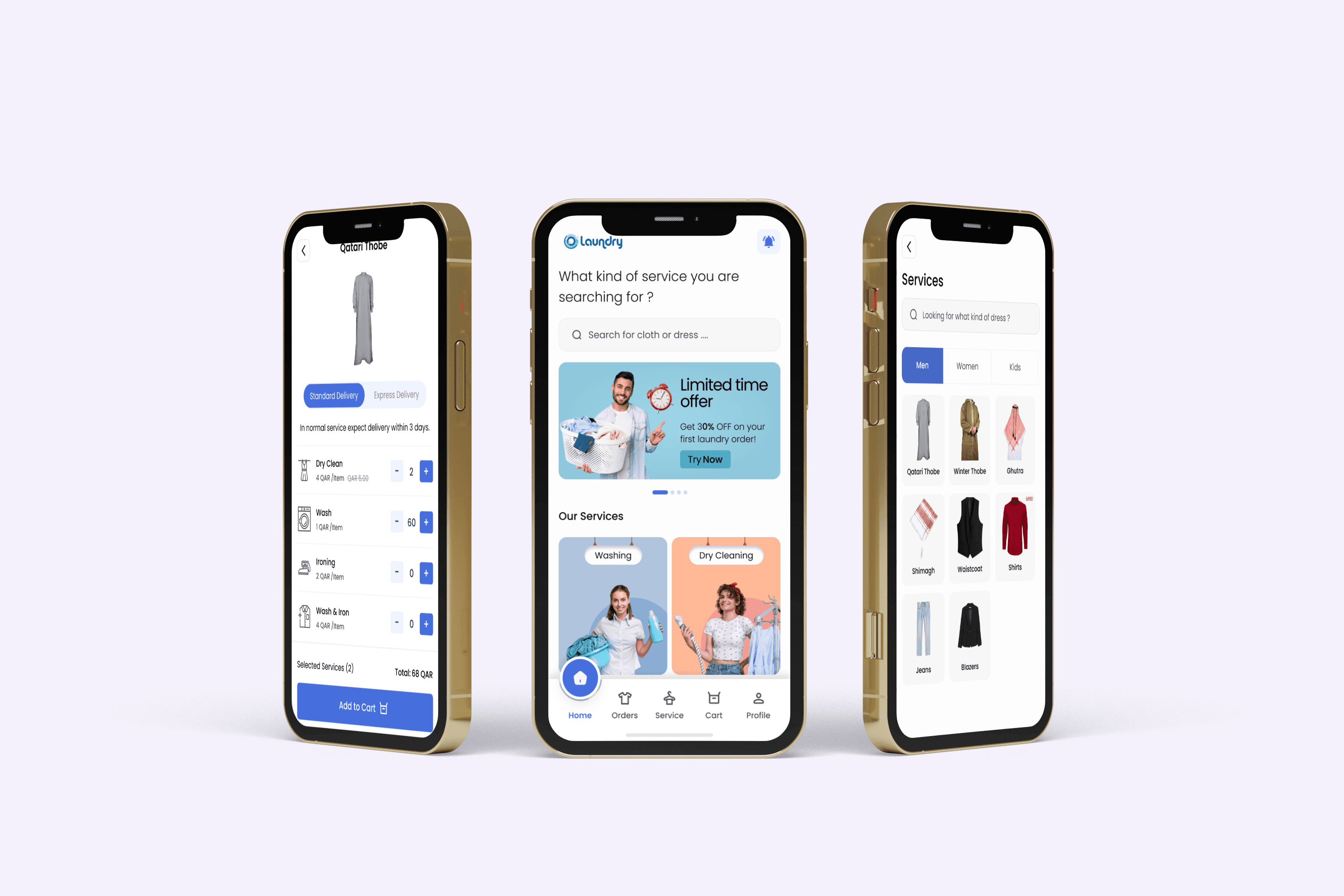
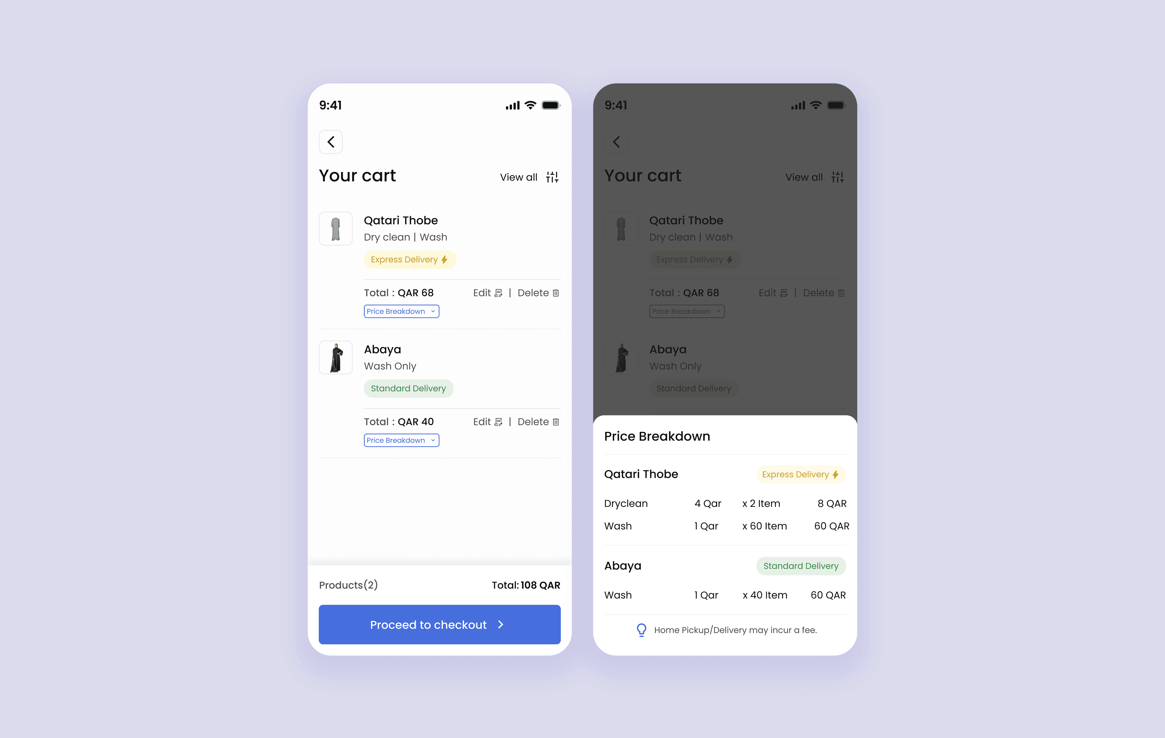
💡 My Solution: One Smart Cart. Many Brains.
I reimagined the cart experience as one unified interface, where services are visually grouped — not technically split.
This way, users feel they’re in one place, while still managing their Normal and Express services separately when they want to.
Key Highlights from the Final Design:
This way, users feel they’re in one place, while still managing their Normal and Express services separately when they want to.
🟨 Clear Tags: Each item is marked as Express Delivery or Standard Delivery
🧾 Inline Price Breakdown: Users can expand service details by item to see exactly what they're paying for
🔎 Filter Option: A filter icon lets users choose to:
View only Express items
View only Standard items
Or continue with the full mixed cart
This gives them the freedom to proceed only with what they need, without forcing hard splits.
Step 5: When Laundry Met UI
Once the logic was in place, it was time to give the experience a soul. Once the logic was in place, it was time to give the experience a soul.
I designed visual selectors that made choosing services feel intuitive, not technical. Pickup and drop options were illustrated like little postcards — clear and clickable. The cart? Split into tidy sections for Normal and Express, but still one smooth journey.
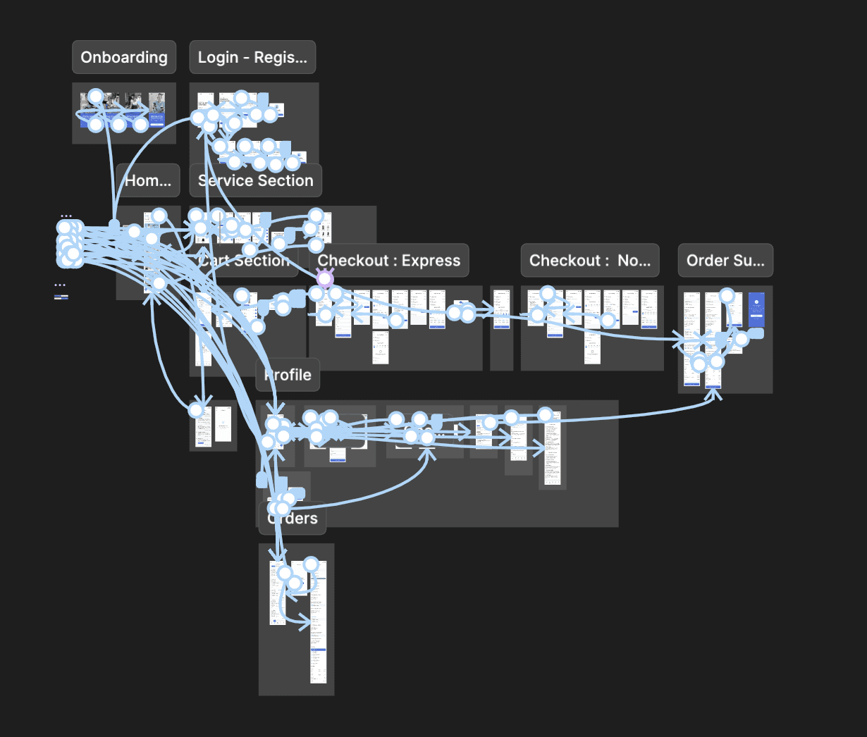
This is my Figma battlefield — every tap, swipe, and “Wait, where am I?” moment mapped down to the pixel. From Onboarding to Order Success, and every sock lost in between — I connected the screens with love, logic, and a lot of auto-layout.


Pressed to Perfection – The Final Screens
After spinning through research, user flows, and iterations, the final designs came out fresh, folded, and oh-so-satisfying.


Every screen was crafted to balance clarity and convenience — like choosing between Express and Normal without breaking a sweat.