The HRMS Journey: Designing a Human-Centric HR Platform
Managing human resources efficiently is key to a company’s smooth operations and growth.
With this in mind, I designed HRMS (Human Resources Management System) — a scalable platform that centralises all essential HR tasks under a unified, easy-to-manage interface.
The main goals were to streamline workflows, cut down manual tasks, and empower both the HR department and employees with a tool tailored to their daily needs.
Workflow Transformation
Productivity Tools
Adobe XD
Client
Links4Engg India
Industry
Human Resources (B2B)
Duration
2 Months
The Spark: A Vision for Simpler HR
Picture this: an HR world where managers don’t wrestle with messy spreadsheets, employees can request a vacation with a single click, and everything feels as smooth as your favorite app. That’s what I set out to create with the Human Resource Management System (HRMS)—a one-stop platform for hiring, managing employees, handling payroll, tracking leaves, and so much more. As the only UI/UX designer on this project, I was ready to make HR tasks not just easy but fun. This is the story of how I turned a big dream into a simple web portal, employee app that everyone loves. Buckle up for the adventure!
Project Goal
Centralize HR Operations
Develop a single platform to manage all HR functions, reducing reliance on disparate tools.
Optimize User Experience
Design interfaces that are intuitive for HR managers, administrators, and employees, across devices.
Enable Customization
Support flexible workflows, such as customizable recruitment stages, to meet diverse organizational needs.
Enhance Accessibility
Ensure seamless access via web and mobile platforms, prioritizing responsiveness and usability.
Act 1
Discovering What People Really Want
As a UI/UX designer, I followed a structured, user-centered design process: Research, Analysis, Ideation, Wireframing, Prototyping, Visual Design, Usability Testing, and Implementation Support. Below is an in-depth exploration of each phase.
What I Did
To build something awesome, I had to get inside the heads of HR teams and employees. This was my detective phase, and I was on a mission to uncover their secrets.
Chatted with HR Heroes
Polled Employees
I sent a quick Google Form to 30 employees, asking how they’d love to handle leaves or check their work hours. Their answers were like treasure maps.
Snooped on Rivals
I checked out some other HR platforms to see what they did well (pretty dashboards!) and where they flopped (confusing menus, yikes).
Watched the Action
I hung out (virtually) with HR folks as they posted jobs and ran payroll, spotting clunky steps that screamed for a fix.

What I Learned
HR managers were drowning in emails and Excel chaos, trying to track candidates. Employees wanted a simple app to request time off without bugging their boss. Everyone dreamed of clear, colorful dashboards that showed the big picture instantly.

Cool Stuff I Made
Superhero Profiles
To keep my design human-centric, I defined 3 key roles who would use the platform daily:

Sarah, the HR Manager
Needs a smooth way to handle recruitment, promotions, and reports — all without needless manual tasks.

John, the Payroll Guru
Wants quick, error-free payroll processing, automated salaries, TDS, and benefits — making sure everyone gets paid on time.

Priya, the Employee
Desires simple, mobile-friendly access to view salaries, apply for leave, check attendance, and track promotions — without confusion.
Problem List
Manual workflows were messy and prone to error
There was a lack of visibility across different modules — from recruitment to attendance.
Employees demanded self-service and greater transparency in their workplace data.
Now that I knew what people needed, it was time to organize my findings into a master plan. Think of it like sorting a giant pile of LEGO bricks before building a castle.
What I Did
Grouped Ideas
I stuck all my notes on a virtual board, sorting them into buckets like “easy to use” and “save time.” It was like a puzzle coming together.
Broke Down Tasks
I listed every step in big tasks, like hiring someone or requesting a leave, to make them super smooth.
Mapped the App
I sketched out the HRMS’s layout, deciding where stuff like Payroll and Leave would live.
What I Learned
The app needed to feel like a toolbox—grab what you need without digging. Employees wanted a simple menu for quick tasks, while HR needed powerful filters. It also had to work for everyone, including people using screen readers.
Cool Stuff I Made
Task Paths
I drew flows like Job Post → Interview → Offer for hiring, and Login → Check Attendance for employees and alot
App Blueprint
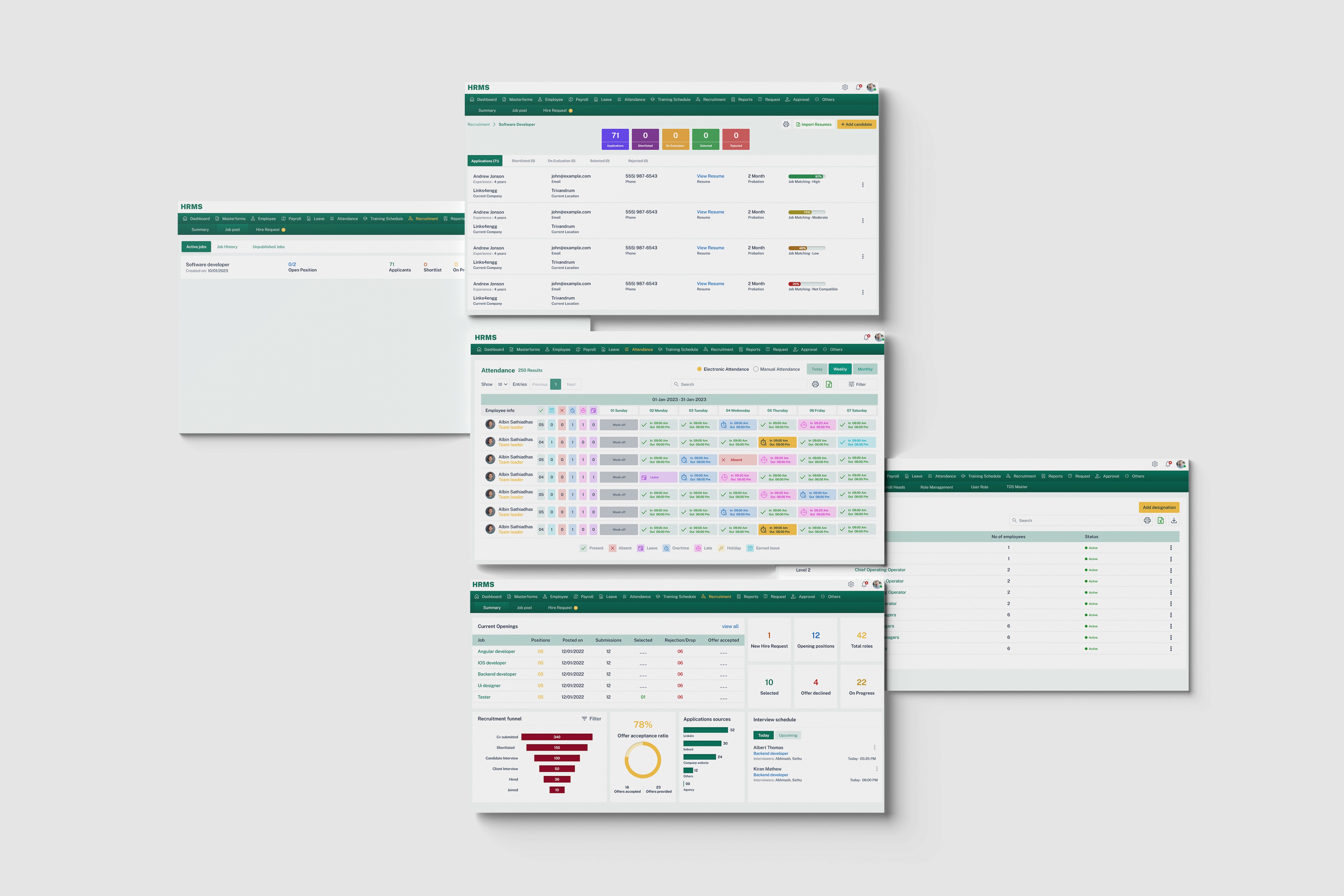
Nine sections—Recruitment, Employees, Payroll, Leave, Attendance, Training, Reports, Requests, Dashboards—with sub-sections like “Job Postings” under Recruitment.
Rules to Live By
Keep it simple (less clicking), consistent (same buttons everywhere), and accessible (clear colors for all).
This was the part where I got to play like a kid with crayons, imagining what the HRMS could look like.
What I Did
Doodled Like Crazy
I grabbed a sketchbook and drew tons of ideas for dashboards, hiring boards, and employee screens. No idea was too wild!
Teamed Up with HR
I ran two fun Zoom workshops with HR folks, scribbling ideas together about how a hiring tool or employee app should feel.
Time to turn my ideas into something real. This was where I built the HRMS from rough sketches to shiny, clickable designs.
What I Did
Drew Basic Layouts:
Using Figma, I created simple wireframes for 60+ screens, like dashboards and leave forms, to nail the structure.
Made It Clickable
I turned wireframes into prototypes you could play with, adding drag-and-drop for hiring and pop-up forms for leaves.
Added Sparkle:
I chose green and yellow — green for a fresh, energetic feel and yellow for a warm, vibrant touch. I went with Public Sans for clear, easy reading, and designed every screen to look polished and inviting.
Helped the Coders
I handed over my designs with a guide for colors and buttons, checked their work, and fixed tiny oopsies like wonky spacing.
Would people love the HRMS as much as I did? I put it to the test to make sure it was a hit.
What I Did
Played with Users
I asked 8 people (2 HR, 4 employees, 2 admins) to try tasks like posting a job or applying for leave on Zoom, watching where they got stuck.
Asked for Thoughts
After each test, I sent a quick Google Form to see what they liked or hated.
Checked the Rules
I compared my design to a list of “good design” rules to catch any slip-ups.
Fixed Stuff
I tweaked things based on feedback, like moving buttons or making messages clearer, then tested again.
Fix List
Added some more filters to the list
Rewrote errors to sound human.
Rearranged some button placement
The HRMS Superpowers
The HRMS is like a Swiss Army knife for HR, packed with nine awesome tools:
What I Did
Hiring
Post jobs, tweak interview steps, send offers, and welcome newbies.
Employees
Track salaries, promotions, loans, and shifts in one spot.
Payroll
Crunch salaries fast with no mistakes.
Leave
See and approve time-off requests in a snap.
Attendance
Check who’s in today, this week, or this month, with cool filters.
Training
Plan courses to level up your team.
Reports
Make charts for raises, attendance, and more.
Requests
Handle employee asks, like new laptops, with ease.
Dashboards
Show the big picture with colorful, clickable stats.
Plus, there’s an employee app and mobile version so everyone can use it anywhere, anytime.
The Grand Finale (and What’s Next)
Here’s how I plan to make this platform smarter, more interactive, and more personalized in future:
Voice Command Integration
Allow busy managers and employees to perform tasks hands-free — like “Hey, show me attendance for this department” or “Add sick leave for John today.”
Chatbot Support (AI Assistant)
Provide instant answers about salaries, promotions, leaves, or training — directly within the platform, 24/7.
Personalized Dashboards
Let employees and managers customize their view with widgets — so each person sees exactly what matters most to them.
Team Communication Integration: