ExploreWorld – Turning an Expanding Vision into an Intuitive Travel Platform
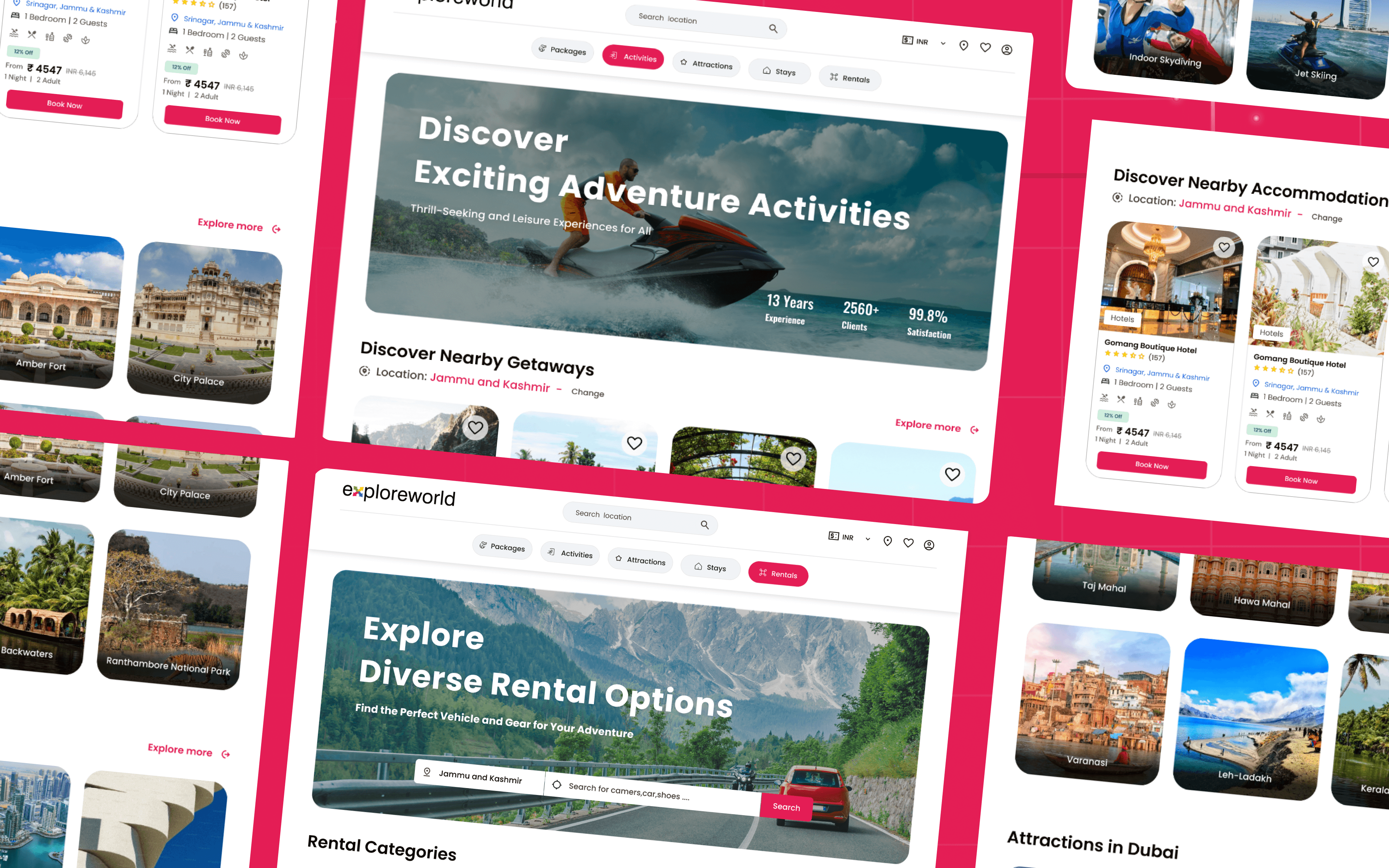
A powerful eCommerce aggregator built for the modern traveler — offering bookings for packages, attractions, rentals, stays, and activities all in one place.
Multi-Service Booking
Product Design
Figma
Client
Industry
Travel & Tourism
Duration
4 Months

ExploreWorld set out to bring together everything a traveler might need — packages, activities, attractions, rentals, and stays — into one unified booking experience. The challenge wasn’t just designing for one service, but creating a seamless system that could scale across many, each with its own logic, filters, pricing, and user expectations.
At the same time, the platform had to compete with established industry players who had years of digital experience. This meant designing not only for discovery and delight, but also for trust and conversion.
As the sole designer, I had to find a way to:
Make a growing, evolving platform feel intuitive and light
Ensure consistency across diverse verticals
Design for both end-users and agents
Balance business needs, user needs, and future scalability — without sacrificing clarity
This was more than a UI challenge — it was a systems design puzzle with real business implications.
User Spotting: Who Are We Designing For?
Every travel platform serves a dream — but dreams come in different forms. To design an experience that works for everyone from adventure junkies to laid-back vacationers, I had to dive deep into who our users really were and what they needed at each step of their journey. It was about guiding different kinds of travelers through discovery, decision-making, and booking, all in one seamless flow.

Backpackers & Solo Travelers


Family Vacationers

Adventure Seekers

Domestic & International Tourists
From User Chaos to Interface Zen
(a.k.a. Why I Didn’t Lose My Mind)
After meeting the cast of users — from solo adventurers and protective parents to thrill-seekers and honeymooners with trust issues — it was clear this wouldn’t be a one-size-fits-all solution. This was going to be a “keep-everyone-happy-without-losing-my-mind” kind of design challenge.
So I rolled up my sleeves, brewed dangerous amounts of coffee, and turned their quirks, complaints, and chaos into design logic.
People don’t explore linearly — So I designed with non-linear discovery paths, where users can start anywhere: by activity, region, or even mood.
Everyone wants trust, but for different reasons — So I added review credibility, trust badges, and visual cues for reliability.
Families need clarity, not just features — So I focused on highlighting safety, group support, and simplified package views.
Solo and adventure travelers act fast — So I made quick actions and booking flows ridiculously fast and mobile-first.
I started with low-fidelity wireframes to validate the structure and flow logic.
Key Focus Areas:
Clean, distraction-free layout
High readability for itineraries & descriptions
Visual hierarchy that promotes discovery
Familiar interaction patterns with subtle enhancements
The original plan?
Design a clean, user-friendly platform just for booking tour packages.
What actually happened? The client took one look at the prototype and said,
“Can we also add attractions? And stays. Oh, and rentals. Maybe activities too?” Suddenly, the project went from a focused sprint to a feature-packed marathon.

This unexpected (but exciting) shift meant quick design pivots, rethinking flows, and building systems that could scale without breaking. I didn’t just design pages — I built a modular ecosystem that could handle it all, from a weekend hike to a full-blown multi-destination adventure.
Suddenly, I wasn’t just designing a booking site. I was building:
A multi-service marketplace for users to plan full journeys
A modular system that could grow without redoing the foundation
A full-blown agent portal where vendors could list, manage, and track their offerings with ease
The scope expanded — but the experience stayed seamless.
Be Fluid, Not Forcing – Let users enter from any interest point (not a forced flow).
Make Trust Visible – Use clean design and transparency as trust-building tools.
Speed Where It Matters – Remove steps where decisions are already made.
Guide Without Controlling – Smart suggestions, not rigid funnels.
Keep It Cohesive – Whether booking an Trekking or a tour package, the design language stays familiar.
This step was like curating a travel bag — only the essentials, no clutter. I mapped out user flows that felt lightweight yet flexible enough to expand as the product grew.
User Flows Designed:
Updated the navigation bar
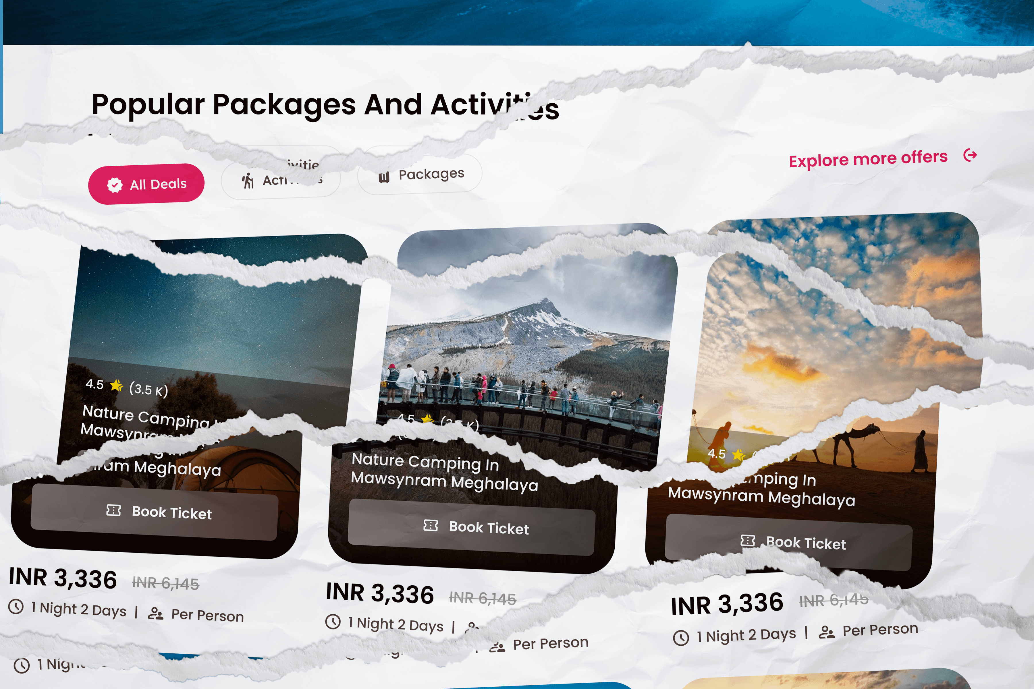
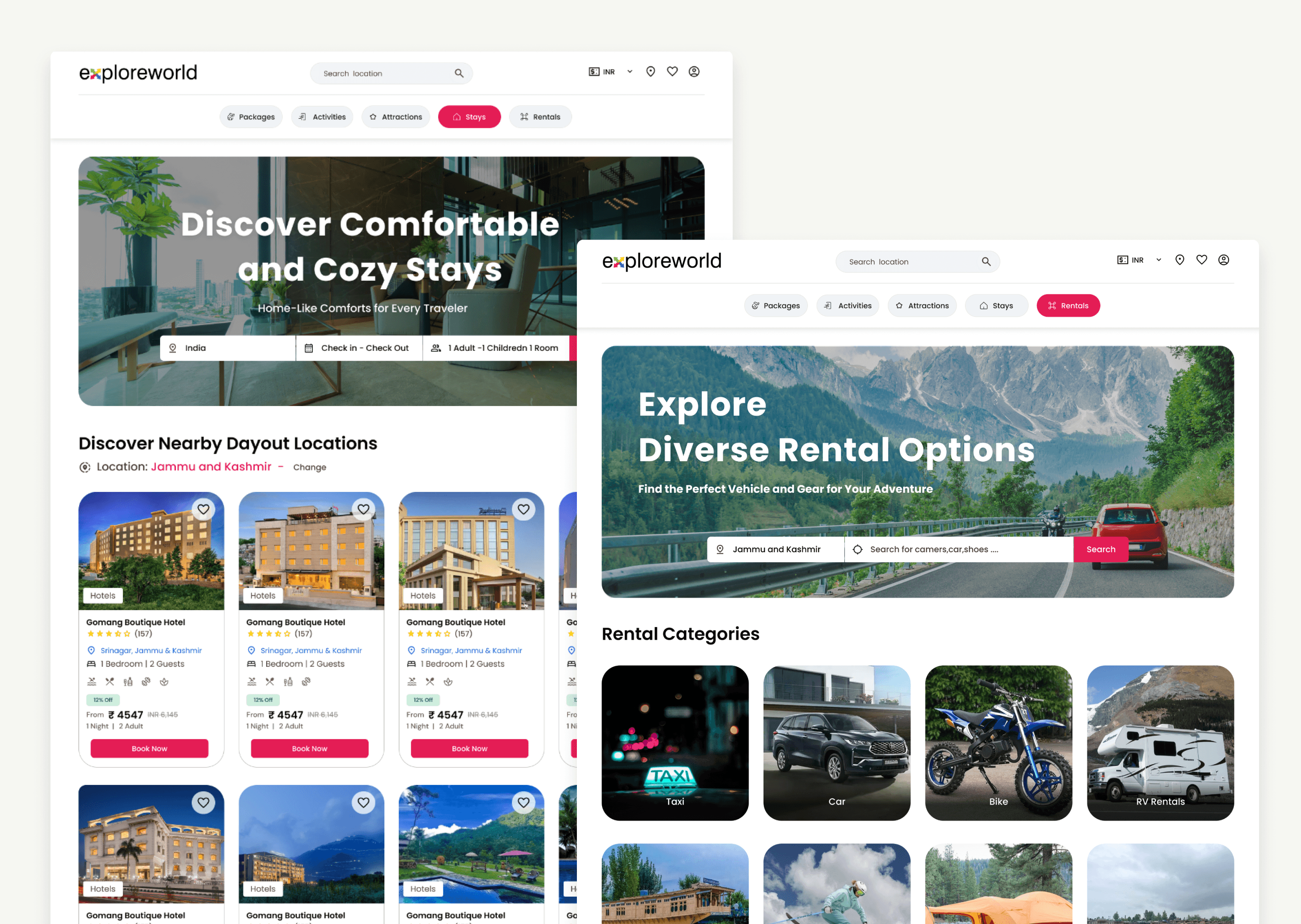
View detailed Package / Attraction / Stay / Activities / Rentals
Book individual services through a streamlined, focused flow
Dynamic filters by region, type, duration, etc.
Seamless checkout with real-time availability
Agent portal for managing listings and bookings of Package / Attraction / Stay / Activities / Rentals
💡 The current version supports booking one service at a time, but the design system was intentionally built to scale into a multi-service cart in future updates — because let’s be honest, travelers usually want more than just one experience.
Everything was built with reusability in mind. A modular flow meant fewer headaches and better scalability as the client’s vision kept evolving.
I performed regular design walkthroughs with the client and internal stakeholders. Key improvements based on feedback included:
Reworking calendar selection. From the calendar itself, the user can understand the price variations.
Improving agent listing creation flow to reduce confusion
Added a new system into the agent portal to manage booking done through other websites.
Everything was built with reusability in mind. A modular flow meant fewer headaches and better scalability as the client’s vision kept evolving.
Designing for agents wasn’t just about function — it was about reducing friction, clutter, and confusion. Since agents manage different types of services (from adrenaline-packed activities to cozy homestays), I created a tab-based system for easy navigation.
Each service type lives in its own clean, contextual space — like having five mini dashboards inside one control room.
Dashboard Tabs for:
Packages
Attractions
Activities
Note : Stays and Rentals are now on hold. Only End user side is completed.
Each tab has its own:
Dashbords
Listing overview (with edit, delete, view stats)
Add New page
Booking Management
Transactions Listing
Enquiry List
This separation made it easier for agents to:
Focus only on what matters per listing type
Avoid errors between unrelated services
Manage large inventories with clarity and speed
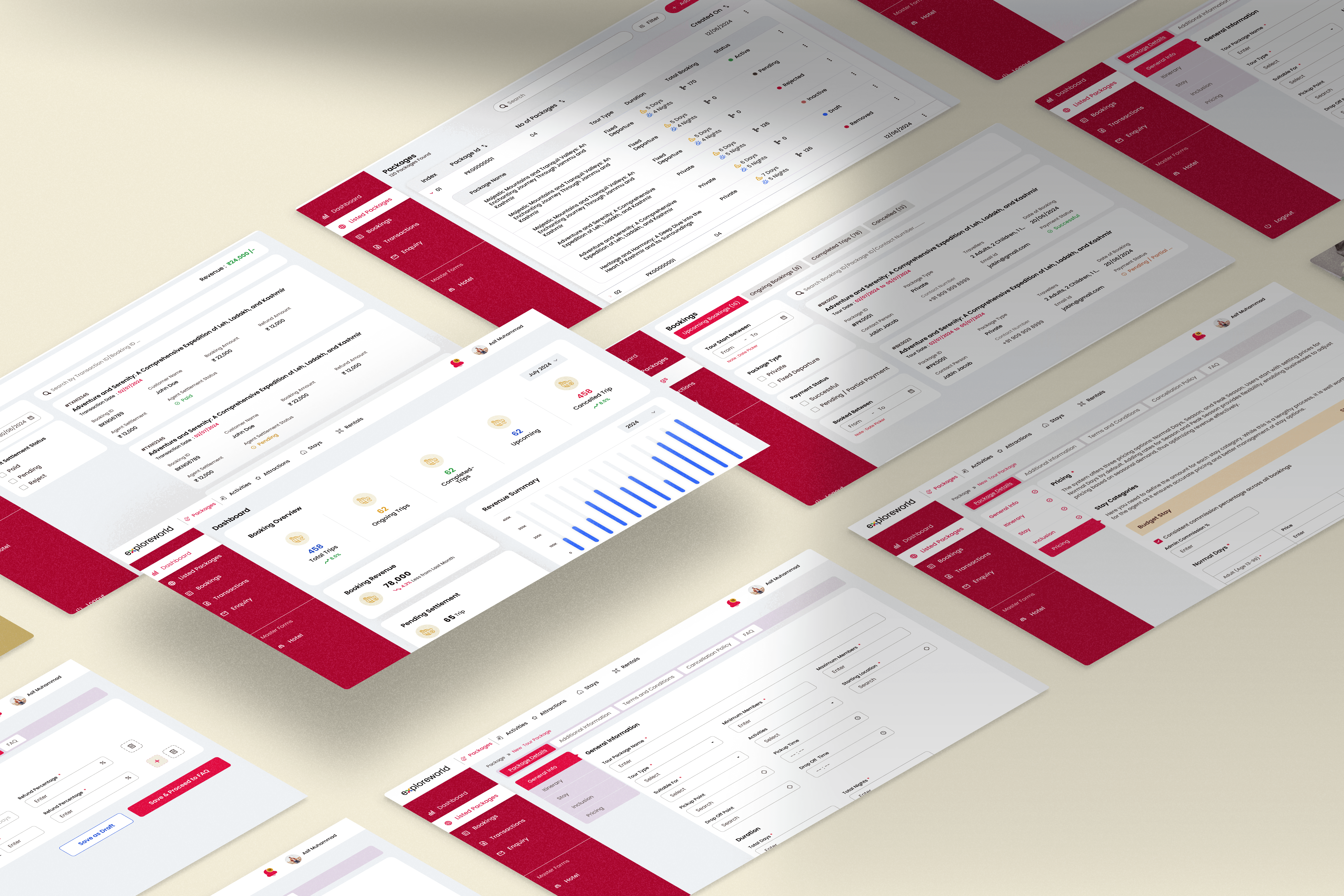
✨ What make me happy : Agents loved it — even those not-so-tech-savvy found it easy to adopt
🚀 Final Outcome
What started as a simple tour package site transformed into a full-fledged digital travel marketplace — with a system smart enough to grow as the client’s ambitions did.
In just 4 months, I:
Translated a 10+ year-old offline business into a modern, modular travel platform
Balanced five different service types in a unified interface — without overwhelming the user
Designed and delivered a dedicated agent portal to manage listings, availability, and bookings with ease
Created a scalable design system that anticipates future needs like multi-service booking, loyalty programs, and mobile app expansion.

🤹🏼♀️ My Learnings
✨ What make me happy : Agents loved it — even those not-so-tech-savvy found it easy to adopt